James Gallagher's blog

Saturday, April 12, 2014

Scatterplot


http://www.netmba.com/statistics/plot/scatter/

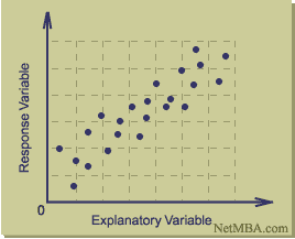
A scatter plot map is used in mathematics and is made by graphing ordered pairs.  Scatter plots can be very helpful to show trends and correlations, generally positive and negative.  The more data that is graphed on a scatter plot, the stronger the correlations become.
Posted by Unknown at 3:08 PM
Email ThisBlogThis!Share to XShare to FacebookShare to Pinterest

No comments:

Post a Comment

Newer Post Older Post Home
Subscribe to: Post Comments (Atom)

About Me

Unknown
View my complete profile

Blog Archive

  • ▼  2014 (50)
    • ▼  April (50)
      • Unstandardized Choropleth Maps
      • Standardized Choropleth Maps
      • Bivariate Choropleth Maps
      • Unclassed Choropleth Maps
      • Classed Choropleth Maps
      • Lorenz Curve
      • Bilateral Graph
      • Index Value Plot
      • Population Profile
      • Climograph
      • Windrose
      • Parallel Coordinate Graph
      • Similarity Matrix
      • Correlation Matrix
      • Star Plots
      • Continuously variable proportional circle map
      • DOQQ
      • DEM
      • DLG
      • DRG
      • Isopleths
      • Isopach
      • Isohyets
      • Isotachs
      • Isobars
      • LIDAR
      • Dopplar Radar
      • Black and White Aerial Photo
      • Infrared Aerial Photo
      • Cartographic Animations
      • Statistical Maps
      • Cartograms
      • Flow Maps
      • Isoline Maps
      • Proportional Circle Maps
      • Choropleth Maps
      • Dot Distribution Map
      • Propaganda Map
      • Hypsometric Map
      • PLSS Map
      • Cadastral Maps
      • Thematic Map
      • Topographic Map
      • Planimetric Map
      • Triangular Plot
      • Histogram
      • Box Plot
      • Scatterplot
      • Stem and Leaf Plot
      • Mental Map
Simple theme. Powered by Blogger.