Wednesday, April 16, 2014

Unstandardized Choropleth Maps


http://eps.mq.edu.au/courses/GEOS219/choropleth.htm

Unstandardized choropleth maps can be determined by whether or not a map is areally averaged. They don't average or standardize the data.  This example of an unstandardized choropleth map exhibits deaths of babies every 1,000 live births in Australia.  The legend classes from bottom to top read: suppressed, less than 5, 5-6, 6-7, 7-10, 10 or more.

Standardized Choropleth Maps

Figure 3.1 Standard choropleth map
http://www.statcan.gc.ca/pub/92f0138m/2008003/figures/5200001-eng.htm

Another type of choropleth map, the standardized map's data is conformed to a standard.  The data is areally averaged for more controllable figures.  This standardized choropleth map demonstrates the percentage of population aged 14 and under in Canada by 2006 Census Division.  The map alludes to the fact that the northern territories contain the largest percent of people 14 and under, while the southern areas of Canada that border the United States generally contain an older population.

Bivariate Choropleth Maps

A screen capture to show the GeoMap display in order to discuss the available gamut of colors used in this map image.
https://www.e-education.psu.edu/geog486/node/1849

The main purpose of a Bivariate chrolopleth map is to display two variables on a single map by combining two different sets of graphic symbols or colors. The bivariate colored rectangle legend in the top right displays how many colors are possibly on the map.  This bivariate choropleth map exhibits the 2008 presidential election between Barack Obama and John McCain by county.  A perfect blend of blue and red is purple, which covers most of the map, telling you it was a close election.

Unclassed Choropleth Maps


http://go.owu.edu/~jbkrygie/krygier_html/geog_353/geog_353_lo/geog_353_lo07.html

Unclassed Choropleth Maps use a continuous grey scale.  There are as many intervals as there are areal units.  Although it doesn't seem there would be many advantages to unclassed choropleth maps, they are good for seeking patterns and minimizes the amount of generalization and simplification.  The unclassed choropleth map above shows population change in the United States from 1960-1970 by county.

Classed Choropleth Maps


http://my.ilstu.edu/~jrcarter/Geo204/Choro/

Classed choropleth maps is a type of choropleth map that is combined into a smaller number of groups and portrayed in intervals.  Typically, four to seven classes are used to display the data.  In the classed choropleth map pictured, there are four classes to represent the amount of males per 100 females in each state in the United States.

Lorenz Curve


http://www.unc.edu/~nielsen/special/s2/s2.htm

A lorenz curve is a graph in which the cumulative percentage of some variable is plotted against the cumulative percentage of the corresponding population.  The extent to which the curve sags below a straight diagonal line indicates the degree of inequality of distribution.  The 45 degree line represents perfect equality so the closer the Lorenz curve is to the 45 degree line, the less the inequality and the smaller the inequality, or Gini coefficient.

Bilateral Graph


http://www.gallup.com/poll/106858/chinas-leadership-better-regarded-outside-west.aspx

A bilateral graph is a visual representation of numerical or other information, often used for comparative purposes.  The graph above is detailing approval rates of the leadership of China.  This bilateral graph is comparing Europe, the Americas, Asia, Middle East/North Africa, and Sub-Saharan Africa.  Immediately, the approval rates in Sub-Saharan Africa jump off the chart.  Highest disapproval rates belong to Middle East/North Africa.  Bilateral graphs facilitate comparisons.

Index Value Plot

Figure 3 ISM Non-Manufacturing Index, 1997-2009
http://www.muhlenkamp.com/investment/principles/whats_the_new_normal_economics_rules_markets

An index value plot is a graph that uses pairs of numbers arranged in a table so that an application can match numbers it knows about to numbers representing colors that an output device knows about.  Most commonly used in the stock market, index value plots help determine the trends of a service by reading the index value.

Population Profile

2010 Census: State Population Profile Maps
http://www.census.gov/2010census/

A population profile is a chart showing the number of people as a function of their ages.  This graph above is the population profile for the District of Columbia by sex and age.  The most visible distinction for this example is the number of older females in D.C. compared to males.  For people 70 and above, the women's figure roughly doubles the male figure.

Climograph

Jacksonville English Units
http://drought.unl.edu/archive/climographs/JacksonvilleANC.htm

A climograph is a graph that depicts the annual cycle of temperature and rainfall for a geographical location.  This climograph is of Jacksonville, Florida and it was the closest city to Tallahassee I could find.  The graph displays precipitation levels and temperatures for each given month throughout the year by using a bar graph to illustrate the precipitation and a line graph to illustrate the temperature.

Windrose

wind rose plot
http://nj.usgs.gov/grapher/tutorial/examples.html

A wind rose is a metorologists graphic tool to assist them in how wind speed and direction are generally distrbuted at a particular location.  This windrose data graph is of the South Shore Meteorologist Station in Klamath Falls, Oregon.  It conveys statistics such as: average wind speed, peak frequency, peak direction, and percent calm.

Parallel Coordinate Graph


http://www.evl.uic.edu/aej/424/kyoung/Training-parallelcoordinate.html

The above image of a parallel coordinate graph creates a readily perceived structure at the common points. In the 1970's the parallel coordinates technique was developed and applied to a diverse set of multidimensional problems.  To create the graph, simply plot all observations on the same graph and often they will overlap creating the structure.

Similarity Matrix


http://bellm.org/blog/2013/02/10/tracing-the-changing-state-of-the-union-with-text-analysis/

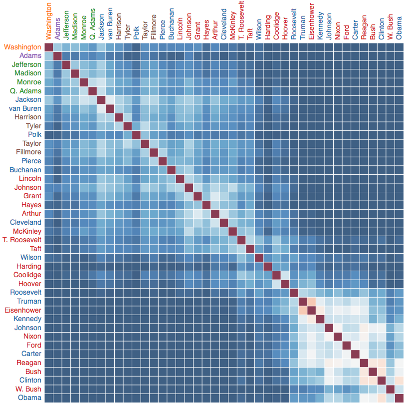
A similarity matrix is a matrix of scores that represent the similarity between and number of data points.  In the figure above, it measures similarities in presidential State of the Union addresses with blue words being uncommon and white being common.  Red is the exact, obviously.  The similarity matrix shows presidents of the near past use more similar words with one another than presidents of distant past.  Overall, the distance of presidents proportionally relates to same verbiage.  Washington and Obama are very dissimilar.

Correlation Matrix


http://www.investors-routemap.co.uk/Guidebook_price_correlation.html

A correlation matrix is a matrix giving the correlations between all pairs of data sets.  This specific correlation matrix show the relationships between the principal bond and forex markets as well as equity regions, sectors, and investing styles.  It's measuring monthly US dollar returns over 35 years.

Star Plots

1979 automobile analysis using star plot
http://www.itl.nist.gov/div898/handbook/eda/section3/starplot.htm

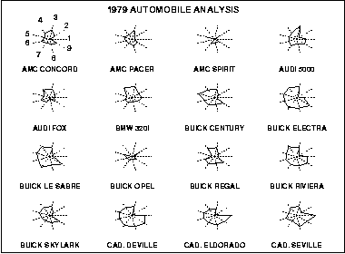
The star plot consists of a sequence of equi-angular spokes, called radii, with each spoke representing one of the variables.  A star plot is a graphical method of displaying multivariate data in the form of a two-dimensional chart or three or more quantitative variables represented on axes starting from the same point.  Each star represents a single observation.  The example above is a star plot containing 16 cars and helps display each car's strengths and weaknesses.

Tuesday, April 15, 2014

Continuously variable proportional circle map

Contact the instructor if you have difficulty viewing this image
https://www.e-education.psu.edu/geog486/book/export/html/1796

A continuously variable proportional circle map show the distribution of data over specified land area.  The larger the size of the circle, the more representation of the data.  The map above shows the largest foreign born group for each country.

DOQQ


http://shop.delorme.com/OA_HTML/DELibeCCtpSctDspRte.jsp?section=10321

DOQQ's (Digital Orthographic Quarter-Quads) combine the image characteristics of an aerial photograph  with the geometric qualities of a map. DOQQ's are georeferenced like the other digital map products, but unlike the others, DOQQ's are orthorectified.   Orthophotos are also useful because photos display features that may be omitted or generalized on maps.  These aerial images were taken with 1-meter resolution over the United States.


DEM


A DEM (Digital Elevation Model) is a digital file consisting of terrain elevations for ground positions at regularly spaced horizontal intervals.  Also georeferenced, DEM's features are tied into coordinate systems, a datum, and a map projection.  DEM's may be used to generate three-dimensional images or colorized to
bring out relief.  The image above is a DEM of Bingham Canyon Copper Mine, Utah, United States. 

DLG

Image of Digital Line Graph hyspography, hydrography, and transportation layers viewed in Global Mapper software
https://www.e-education.psu.edu/natureofgeoinfo/c7_p7.html

A DLG (Digital Line Graph) is a digital vector data.  Data about map features are stored in lines, points, and areas.  DLGs contain a wide variety of information including: topograpy, hydrography, boundaries, roads, utility lines, etc.  Above is a portion of three digital line graph layers for USGS Bushkill, PA quadrangle.

DRG

Digital Raster Graphics
http://topomaps.usgs.gov/drg/

A DRG (Digital Raster Graphics) is a scanned image of a U.S. Geological Survey (USGS) standard series topographic map.  Georeferenced, it's features are tied into a coordinate system, a datum, and a map projection.  The picture shown above is a 7.5-minute digital raster graphic.

Isopleths

isopleth maps
http://www.jsu.edu/dept/geography/mhill/phygeogone/isoplth.html

An isopleth is a line on a map connecting points having equal incidence of a specified meteorological feature.  Isopleths show data as a third dimension on a map and help map surface elevations, amount of precipitation, and atmospheric pressure statistically.

Isopach

An isopach (isopachyte) map for the Purbeck Group of southern England, based on, and modified after, Howitt (1964), with contours in feet, and with additional interpretation
http://www.southampton.ac.uk/~imw/Durlston-Bay-Lower-Purbeck.htm

An isopach is a contour line on a map that connects points beneath which a particular stratum or group of strata has the same thickness. Isopach maps are often utilized in volcanology.  This isopach map is for the Purbeck Formation of southern England and the English Channel.

Isohyets

Rainfall Map For October 2012 (isohyets are in millimetres)
http://www.hko.gov.hk/wxinfo/pastwx/mws201210.htm

Isohyets are used in forecasting weather, particularly rainfall.  Isohyet lines are lines on a map connecting points that have had the same amount of rainfall in a given period.  This picture is an extract from Meteorological Observations in Hong Kong for 2012.  Isohyets are helpful in predicting rain patterns.

Isotachs

NAM40 250 mb heights and isotachs at 1800 UTC on 18 December
http://www.weather.gov/gsp/18-20DecemberWinterStorm

An isotach, also known as isokin, is a line on a weather map connecting points of equal wind speed.  Similar to isobars, but rather than connecting pressures, isotachs connect wind speeds.  This map covers most of the eastern United States.

Isobars


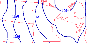
Isobars are contour lines on a map that meteorologists use to predict the weather.  These lines connect points of equal atmospheric pressure at a given time or on average over a given period.  The isobar map located above shows pressure levels west of the Great Lakes.

LIDAR

LIDAR image of ground zero.
http://www.noaanews.noaa.gov/stories/s798b.htm

LIDAR, which stands for "light detection and ranging" is a remote sensing technology that measures distance by illuminating a target with a laser and analyzing the reflected light.  LIDAR can be used to measure distance, speed, rotation, chemical composition and concentration.  The picture above is a LIDAR image from ground zero on September 27th, 2001. These were taken aerially from an altitude of 3,300 feet by NOAA.

Dopplar Radar

NOAA National Weather Service Melbourne, Fla., Doppler radar image of Hurricane Frances taken at 11:34 p.m. EDT on Sept. 4, 2004, as the western edge of the powerful storm’s center moves inland on the Florida east coast.
http://www.noaanews.noaa.gov/stories2004/s2311.htm

Dopplar radar is a critical tool in modern day weather forecasting.  Doppler radar is a radar tracking system that uses the Dopplar effect to determine the location and velocity of a storm, clouds and precipitation.  The different colors represent different levels of precipitation and storm strength.  This picture represents Hurricane Frances making landfall in Florida in 2004.

Black and White Aerial Photo

Black and white aerial photograph of Pearl Harbor region on Hawai'i.
http://pubs.usgs.gov/of/1995/of95-017/

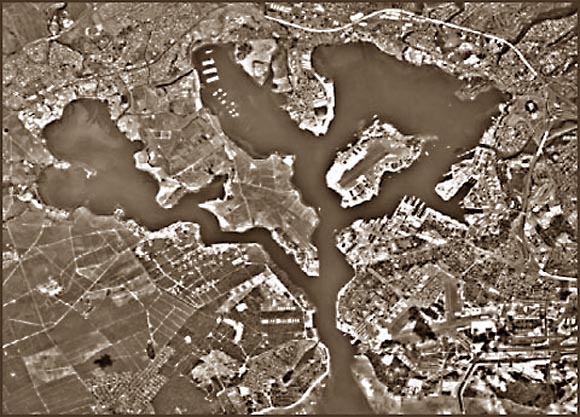
Another aerial photograph is the black and white.  This form of remote sensing is also taken from above, often in space.  Black and white film is used to make a picture appear differently than with color.  This picture is of Pearl Harbor, HI and you can clearly see water depths easier in black and white than you would in color.

Infrared Aerial Photo

scotia
http://casde.unl.edu/imagery/cir/index.php?county=greeley&city=scotia

Infrared aerial photo's are taken from a bird's eye perspective, often from space.  Infrared is used as a filter because film is sensitive to visible light.  These photos are used to create a more visual aspect than that of using just visible light.

Cartographic Animations

Hurricane Katrina Storm Track Probability

Cartograpic animations are generally used to depict change over time.  These types of maps are common in predicting hurricane paths and can show either a predicted storm pattern or the actual path taken.  This cartographic animation is of Hurricane Katrina right before the storm made landfall.  Given it's projected path and the chances of hitting that path, represented by different colors, southeastern states were given a hypothesis of exactly what the storm may do.

Statistical Maps

State Summary Map
http://www.totalcustomeranalytics.com/geocoding.htm

A statistical map is a map in which the variation in quantity of a factor in a geographic area is indicated.  There are many types of statistical maps including dot maps, choropleth maps, and proportional symbol maps.  The statistical map above displays customer totals by state.

Cartograms


http://www-personal.umich.edu/~mejn/cartograms/

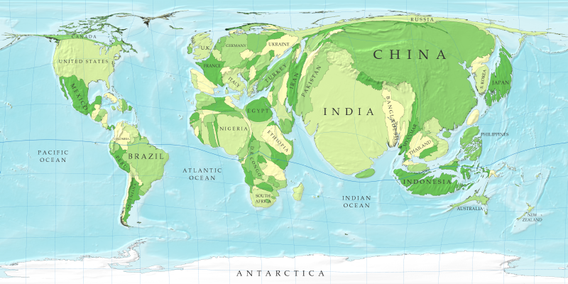
A cartogram is sometimes referred to as a "value-by-area" map.  Cartograms take regular maps and depending on what the cartogram is measuring, will alter the geography proportionally to the data.  This is probably the most famous cartogram as it shows the countires of the world drawn to scale in terms of population.  As you can see, India and China have grown substantially whereas a country like Canada is minimized.

Flow Maps

Telecommunications Traffic Flow Map (click for larger view)
http://mappa.mundi.net/maps/maps_014/

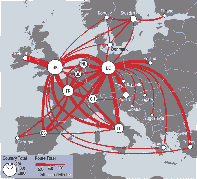
Flow maps are used to show the movement of objects from one location to another.  Data generally shown in flow maps includes: immigration, trading of goods, and travel routes.  This map illustrates traffic flows between European countries in terms of red lines.  The thicker the red line the more millions of people traveling that traffic flow.  For example, UK to Norway is seldom traveled in comparison with UK to Ireland.

Isoline Maps

Figure 6.4: Isoline map.
http://giscommons.org/output/

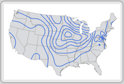
Isolines maps use contour lines to reference differences across a continuous surface.  Isolines' most common application is everyday on the weather channel.  Isolines are used show high and low pressure systems and the fronts associated with them.  This map shows the isolines across the United States.

Proportional Circle Maps

Population and federal expenditures by state, 1995.
https://www.e-education.psu.edu/geog160/c3_p14.html

Proportional circle maps are proportional symbol maps that use circles specifically.  It is a widely-used form of thematic mapping that compares many areas in a geographic region, states in this example.  Each area is then given a circle proportional to the data being processed.  In this example, the circles are comparing population and federal expenditures by state.

Choropleth Maps


http://my.ilstu.edu/~jrcarter/Geo204/Choro/

Choropleth maps uses different shadings to represent different values.  These maps are often used do display differences between the smaller fragments of a whole, like the individual states of America or counties in a state.  The shading in choropleth maps is helpful in developing trends.  For instance, in this map, the number of males per 100 females are far more in western rural states than in the states East of Texas to the coast.  Alaska and Nevada prove to be the most abundant states in terms of male population.

Monday, April 14, 2014

Dot Distribution Map

Figure 5
https://www.e-education.psu.edu/geog485vba/l7_p7.html

Also known as dot density maps, dot distribution maps use dot symbols to demonstrate what the map is representing.  Dot distribution maps are often used for population density but can be used many other ways.  In this map, the dots represent locations of meth labs in 2005 where 1 dot equals 5 labs.  As you can see, in this map, the majority of meth labs in 2005 are located in the middle of the United States.  It also leaves Albuquerque, New Mexico dotless, keeping Walter White discrete.

Propaganda Map


http://www.geocurrents.info/geonotes/maps-as-an-instrument-of-propaganda-part-1

Propaganda maps are made in attempt to mobilize viewers for a purpose.  Cartoons are often used in propaganda maps to demonstrate an activity or political view of a specific geographic region.  Often, tourism state maps will use propaganda to locate different tourist locations while characterizing what activity's are popular there.  These maps can catch the eye and achieve the interest of the reader.

Hypsometric Map

hillshade map Switzerland, Austria, Slovenia
http://www.scilands.de/e_index.htm?page=/e_service/e_downloads/e_shaded_maps/shaded_maps.htm

Hypsometric maps are used to display elevation on a map.  The word "hyspometric" is a scientific term related to measurements of heights.  These maps are useful when locating a mountain range on a national or global map.  Another application of hypsometric maps is the viewing of the ocean's depths.  This map is showing the elevation of Switzerland, Austria, and Slovenia area.

PLSS Map

Map of states included in the Public Land Survey System
http://nationalatlas.gov/articles/boundaries/a_plss.html

A PLSS (The Public Land Survey System) Map is map that divides public domain lands.  The map above divides the United States.  All lands in the public domain are subject to subdivision which is regulated by the U.S. Department of the Interior, Bureau of Land Management.

Cadastral Maps


http://www.cadastraltemplate.org/fielddata/d2.htm

Cadastral maps are important because they show boundaries and ownership of land parcels.  These maps are often used in real estate to determine who owns a certain property.  If a property's owner is in question, one would use a cadastral map to determine it's ownership.

Thematic Map

US map showing percent population change by county from 1990 - 2000
https://www.e-education.psu.edu/natureofgeoinfo/book/export/html/1553

A thematic map is a type of map or chart that is intended to show a particular theme in a geographic region.  Themes often used in these maps can include include: population density, political standing, rainfall, median age, air pollutants, etc. Thematic maps are among the most common forms in geographic information produced by GIS.  The map above shows population change in the United States by county from 1990 to 2000.

Saturday, April 12, 2014

Topographic Map

topo sample
http://geology.isu.edu/geostac/Field_Exercise/wildfire/topography.htm

Topographic maps are detailed and accurate representations of features on Earth's surface.  These maps represent a three dimensional surface by using contour lines to portray relief, the shape and elevation of the land.  Helps identify hills, draw, cliff, spur, ridge, valley, saddle, and depression.

Planimetric Map

Planimetric Map
http://www.webpages.uidaho.edu/niatt_labmanual/Chapters/roadwaydesign/theoryandconcepts/SurveysAndMaps.htm

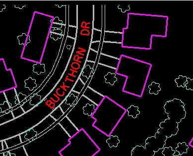
Planimetric maps only show the horizontal position of features on Earth's surface.  Planimetric maps omit elevation, roads, buildings, and bodies of water.  These maps digitally captures cultural and natural features and is useful for a variety of engineering, planning, and GIS applications.

Triangular Plot

A triangular plot, representing pure cobalt, zinc, and nickel oxides at each of its corners, and oxide compounds of the three elements in its interior, includes one thousand overlapping dots that are color-coded to represent the conductivity of each combination of compounds. The logarithm of the conductivity varies from -2 near the zinc corner to +2 in the vicinity of a point that is a third of the way between the cobalt and nickel corners. This point is labeled as Co2NiO4,
http://www.nrel.gov/continuum/deliberate_science/inverse_design.cfm

A triangle plot is a triangular shape that three variables which sum to a constant.  This particular triangle plot shows the electrical conductivity for one thousand oxides containing Cobalt, Nickel, and Zinc.  Most of the plots in this graph trend towards Cobalt.

Histogram

Histogram
http://www.mathsisfun.com/definitions/histogram.html

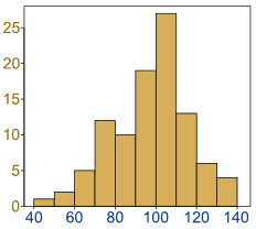
A histogram is often used in mathematics to show data.  A histogram uses rectangles to display the data.  Very similar to a bar graph, but a histogram shows values for equal ranges rather than just one figure.  In this particular example, the values between 100-110 contain the most data while values 40-50 contain the smallest amount of data.

Box Plot


http://nelsontouchconsulting.wordpress.com/2011/01/07/behold-the-box-plot/

A box plot is a graphical rendition of statistical data based on the minimum, first quartile (or lower quartile), median, third quartile (or higher quartile), and maximum.  The figure above is a box plot in a simplified form.  The name "box plot" is given due to its box shape.

Scatterplot


http://www.netmba.com/statistics/plot/scatter/

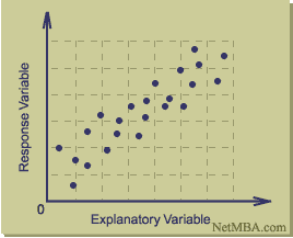
A scatter plot map is used in mathematics and is made by graphing ordered pairs.  Scatter plots can be very helpful to show trends and correlations, generally positive and negative.  The more data that is graphed on a scatter plot, the stronger the correlations become.

Stem and Leaf Plot


http://www.eduplace.com/math/mhm/5/06a/

A Stem-and-Leaf Plot is used in mathematics where values are split between "stem" and "leaf" to more adequately visualize a group of data.  The "stem" is generally used for the first digit while the "leaf" generally used for the last digit.  In the picture above, the number 81 is split between stem and leaf to better organize the data.

Mental Map


mental map.jpg
http://blog.education.nationalgeographic.com/2010/05/18/create_a_mental_map_of_your_community/

A mental map refers to a person's point of view perception of their area of interaction.  This particular example exemplifies a mental map because it showcases an individual's personal perception of their life and the important places they travel.  It conveys that this person knows where all forms of transportation are to be used and where to ride their bike to when they are feeling the urge for sushi.